User Interface Customization

APM enables you to customize any element of the user interface (UI). Customizing the UI offers many advantages, from changing text labels to match terms used in your organization, to adding entirely new views for custom object extensions or subtypes.
You can add new custom views and make changes to existing custom views on your local computer without locking the system. However, you must lock the system and then unlock it to copy those changes to the server, making them available to all users of APM.
You must have an administrator’s license to customize the UI and to lock the system. Adding and deleting elements of the UI does not result in the addition or removal of tables and columns in the database, so you cannot lose data simply by customizing the UI.
Before creating any customizations, you should also review the following topics:

Contents

Adding Attributes and Relationships
View Types
Forms Editor

Adding Attributes and Relationships

For more information on the object model, see Object Model Overview.
TOP

View Types

You can create a variety of different custom views, including primary windows, dialog boxes, and selector dialogs. No matter what type of view you create, you can add existing APM attributes and relationships as well as customized attributes and relationships.
TOP

Primary Windows

Primary windows are views that appear in the view bar. They can hold many attributes on one page or several pages, and they can usually be resized at run-time.
Generally, each primary window on a class contains information used by different people to obtain different types of information. For example, the Asset class has several primary windows, including Properties, Hierarchies, Work Requests, Work orders, Indicators, and so on.

Dialogs

Dialogs are views that appear when the user clicks a button or selects a menu option. When you create a dialog, you must add a button or menu option to a primary view to provide access to the dialog. A button to close the dialog appears automatically on the dialog itself, but you must add any other buttons you want. Dialogs are generally used when you need to collect information once and users do not need to refer to that information very often. You can include multiple pages on dialogs.
Dialogs are often used to collect setup information and properties. For example, a series of dialogs collect the Work Types used at your site. Because you usually set up work types once and do not need to refer back to them often, dialogs provide easy access without cluttering the user interface with information you don’t need on a day-to-day basis.

Selector Dialogs

A selector dialog gives users the ability to browse and select the correct item(s) for a References One or References Many control. A dialog or primary window includes the relationship control as well as a button labeled “Browse”. Clicking the Browse button opens the selector dialog. Thus, once you create the selector dialog, you must add a Browse button that opens the selector to a view.
Selector dialogs usually consist of a table and table configurations, so that the user can apply search criteria and filters to find the required information quickly. One selector dialog can include several pages, each with a different table. You can use check boxes within the selector dialog if the user can select more than one item (for References Many controls), or you can simply have the selector dialog select the item and close when the user clicks the OK button (for References One controls).
An example of a selector dialog is the Browse Catalog view on the Work Order class. When you plan a work order, you can use the Browse Catalog selector dialog to find and select all of the requirements you need quickly and easily.
TOP

Notebooks

A notebook is a compilation of related pages, and is usually represented in the UI as a series of tabs. For example, the asset’s Properties view includes a notebook that contains the General, Downtime, Documents, Photos, i-models, Manufacturer, and Options tabs and another that contains pages such as Location, Age, Alternate Hierarchies, and Descriptions tabs.

Panels

Panels are reusable containers of data fields, attributes, or methods. A panel contains one or more notebooks. When a panel is modified, the changes appear wherever the panel is used.

Forms Editor

The Forms Editor is the tool that you use to design the user interface, whether you are customizing existing views or creating new ones. The Forms Editor includes a layout panel and provides access to all of the elements you can add to views, including attributes, accessories, methods, and relationships.
Tip: You can right-click the banner of a dialog and select Customize, and it will open that banner for editing in the APM Forms Editor.
Tip: If you are logged in as an administrator, you can press Ctrl + Shift + click from within a view or panel to display the Control Properties dialog. On this dialog you can determine if the view or panel is original or customized; for example, customized classes are part of the CustomerData system. If you click Customize, the view opens for editing in the Forms Editor. For more information, see Customizing UI Controls from the User Interface.

Attributes

You can use the Attributes tab in the Forms Editor Toolbox panel to add attributes and enumerated lists to views. Attributes and enumerated lists appear for one class at a time in alphabetical order based on the user interface text for the item. In the APM Forms Editor, you can navigate to linked classes by opening the Class field in the Join Path panel and following the join path to the class you want to access next. The following dialog shows the Attributes tab open to the Work Order class.
The control that appears in the user interface is determined by the attribute’s data type or the relationship type of the item you add. See Data Types and Relationship Types for examples of the various user interface controls.

Methods

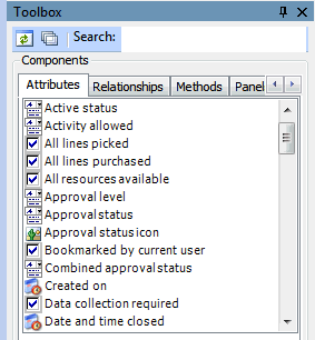
The Methods tab enables you to add buttons to the user interface that, when clicked, invoke a method. This dialog shows you a number of standard methods as well as the methods created in the base class for the class you have selected in the Attributes tab.
See Methods for a description of the standard methods. You cannot currently add custom methods to this list.

Relationships

The Relationships tab lists the relationships for the join path that is selected in the Join Path panel. Relationships appear for one class at a time in alphabetical order based on the user interface text for the item. See Relationship Types for examples of various relationships.

Accessories

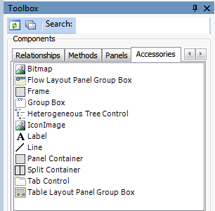
The Toolbox Accessories tab provides access to twelve standard elements that you can use to organize fields on your views. The options available here are the same for every class you customize, but the Tab Control option is available only for multi-page views. The following dialog shows the Accessories tab.
Bitmap: The bitmap accessory enables you to add bitmap icons and graphics to views. You can select from a library of graphics when you click the Bitmap ID field in the Forms Editor Properties panel. You cannot currently add graphics to the library.
Flow Layout Panel Group Box: The flow layout panel group box accessory combines controls in a container. When the group box is resized, the contents flow within the box and are auto-arranged.
Frame: The frame decoration adds an outline around fields. You can size the frame and place it around the appropriate fields.
Group Box: The group box accessory combines the label and frame accessories, adding an outline with a space for a caption at the top. This accessory is the most common way to group fields on a view.
Heterogeneous Tree Control: The Heterogeneous Tree Control accessory provides a hierarchal representation of an object and its sub-components.
Icon Image: The icon image enables you to add an icon to the view. It is similar to the Bitmap accessory.
Label: The label decoration enables you to add a caption to the view.
Line: The line decoration enables you to add a horizontal line between fields on your view or panel.
Panel Container: The panel container accessory is a placeholder for reusable panels.
Split Container: The split container accessory provides two or more resizable sections that can be arranged either horizontally or vertically. A moveable splitter bar separates the sections.
Tab Control: The tab control accessory enables you to add a multi-tabbed notebook to your view.
Table Layout Panel Group Box: The table layout panel group box is a container in which you can place different controls (for example, graphs, tables, gauges or text boxes) so that they form a grid. Each individual control is considered a cell in the grid, and each cell can have only one control. When the table layout panel group box is re-sized, its contents are re-sized proportionately.

Dialogs

You can add buttons that open custom dialog boxes through the Dialogs tab. If you create a dialog for a customized class, you need to add a button to a view in order to provide access to that dialog. Simply dragging the appropriate dialog from the Dialogs tab onto the view will add the button and create the link necessary to open the dialog. You can change the text that appears on the button if necessary.
TOP