Note: If you select None as the analysis type, the
Analysis view does not display the
Analysis tab and graph. Readings for the time period, current values, and activities are shown in tables.
If you are using the default options for the basic analysis type, the Analysis view,
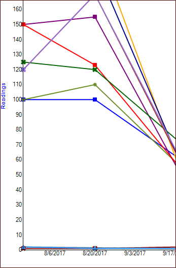
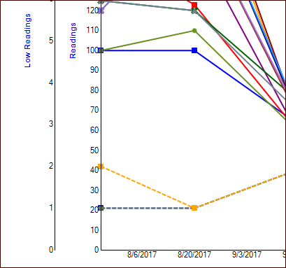
Analysis tab shows a graph of the indicator readings collected over the time period that you selected. The legend at the bottom of the graph shows each indicator’s name, asset, color, and shape for reading occurrences. Here is an excerpt from a basic analysis:
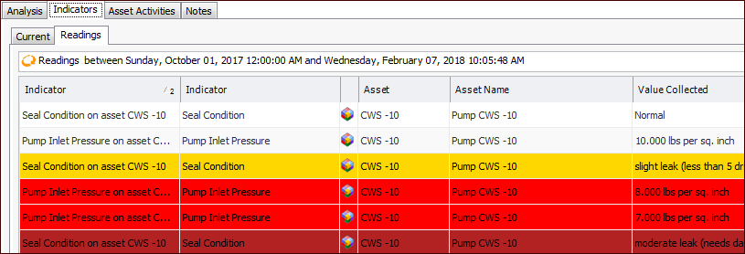
In the Analysis view,
Indicators tab, you will also find the
Readings tab. This tab lists the readings by indicator and includes each indicator’s asset, value collected, and collection date and time.
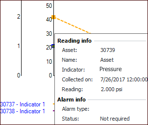
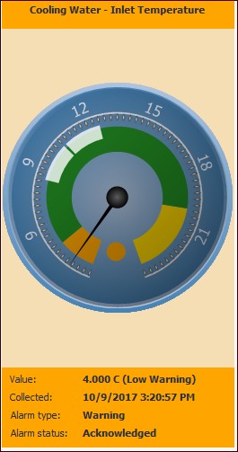
In the analysis properties, the Show gauge sidebar option is selected by default. This allows you to select a reading in the table on the
Readings tab to quickly view the value collected and alarm status in the gauge. For example:
In analysis properties, the Show current values option is selected by default. This provides the
Indicators tab,
Current tab in the
Analysis view. The
Current tab lists the indicators included in the analysis, their assets, current values, and last collection date.
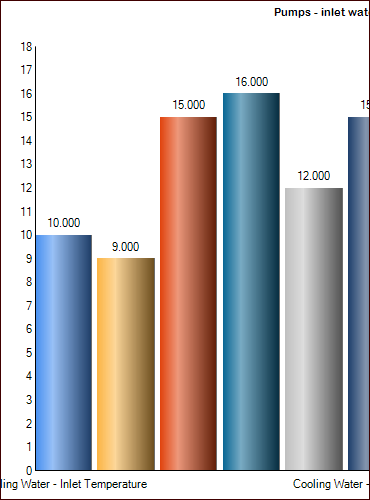
Select the Chart icon (
) to view the values in the default bar chart. Here is an excerpt:
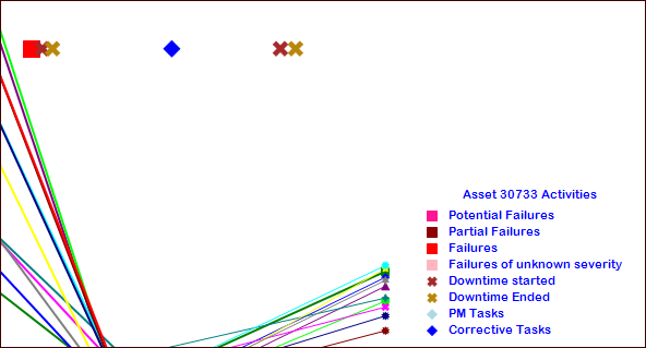
You can display one asset’s activities in the Analysis and
Asset Activities tabs in the
Analysis view. Select from these activities:
In the Analysis view, select the
Asset Activities tab to view tables of the asset’s activities. You can choose from these table configurations:
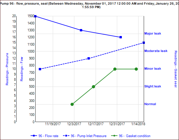
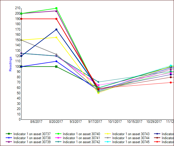
As with basic analyses, use the Indicators to Compare tab to browse for as many indicators as you like. Then, on the
Chart Indicators tab, select up to 12 indicators from this list to compare in the readings graph, shown in the
Analysis view,
Advanced Analysis tab.
Alternatively, you can add one descriptive indicator to an analysis that otherwise compares only numeric indicators. The Analysis view,
Advanced Analysis tab displays the indicator states on a secondary axis, as well as the indicator readings. This example shows numeric and descriptive secondary axes:
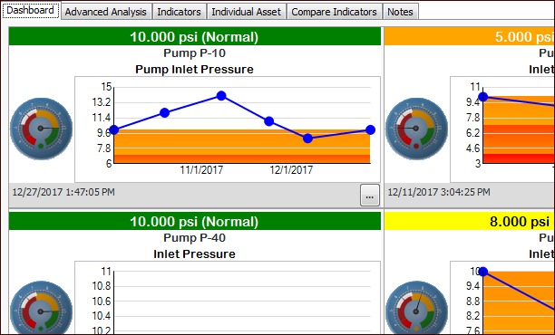
In an advanced analysis, you can select Show side-by-side comparison in the
Properties view,
Options tab. This adds the
Dashboard tab to the
Analysis view. The dashboard displays as many as 12 indicators. Here is an excerpt from an example analysis:
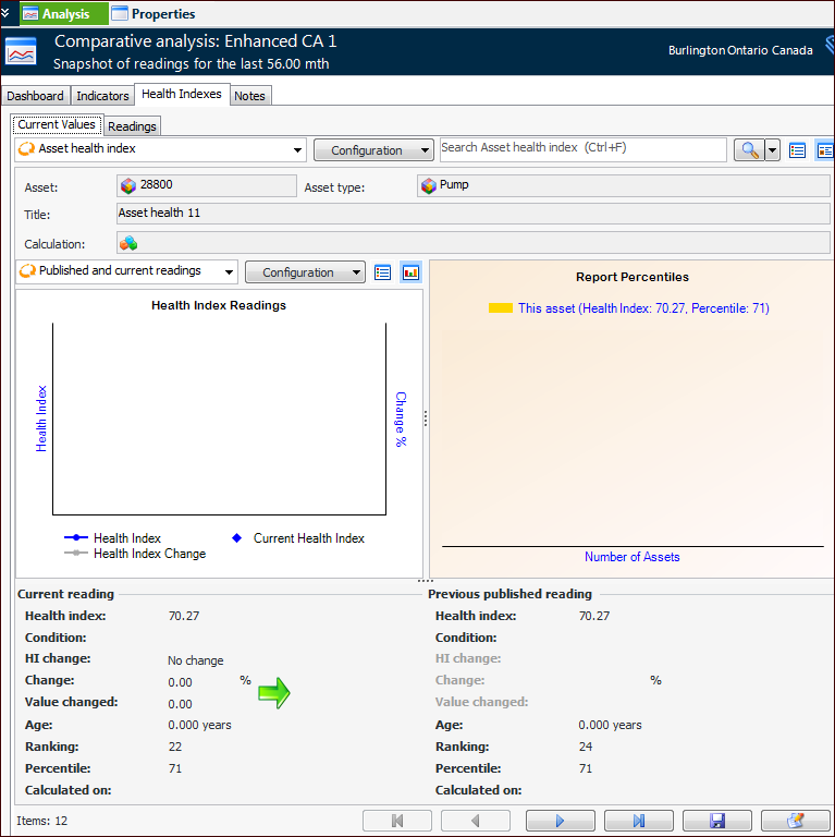
In the Analysis view, the
Health Indexes tab shows
Readings and (if selected in properties)
Current Values tabs. For example, the
Current Values tab shows the indexes as forms. Use the arrow keys to move from one index to the next.
If indicators have also been selected, the Advanced Analysis tab displays both readings and health indexes.
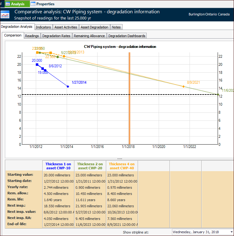
In the Analysis view, the
Degradation Analysis tab,
Comparison tab displays a graph of readings that occurred during the designated time period, as well as the degradation reading values, next inspection dates, and end-of-life dates. For example:
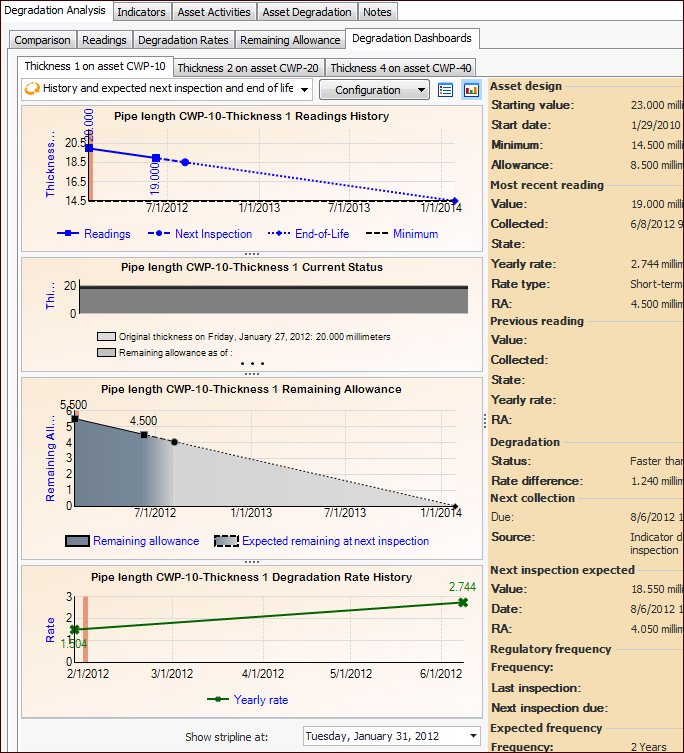
The Readings,
Degradation Rates,
Remaining Allowance, and
Degradation Dashboard tabs present side-by-side views of degradation information. The
Degradation Dashboards tab presents each indicator on its own tab. For example:


 ) to view the information for individual indicators.