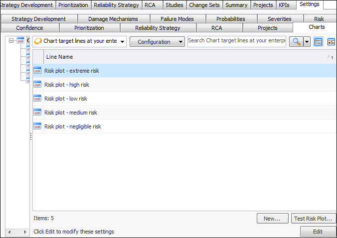
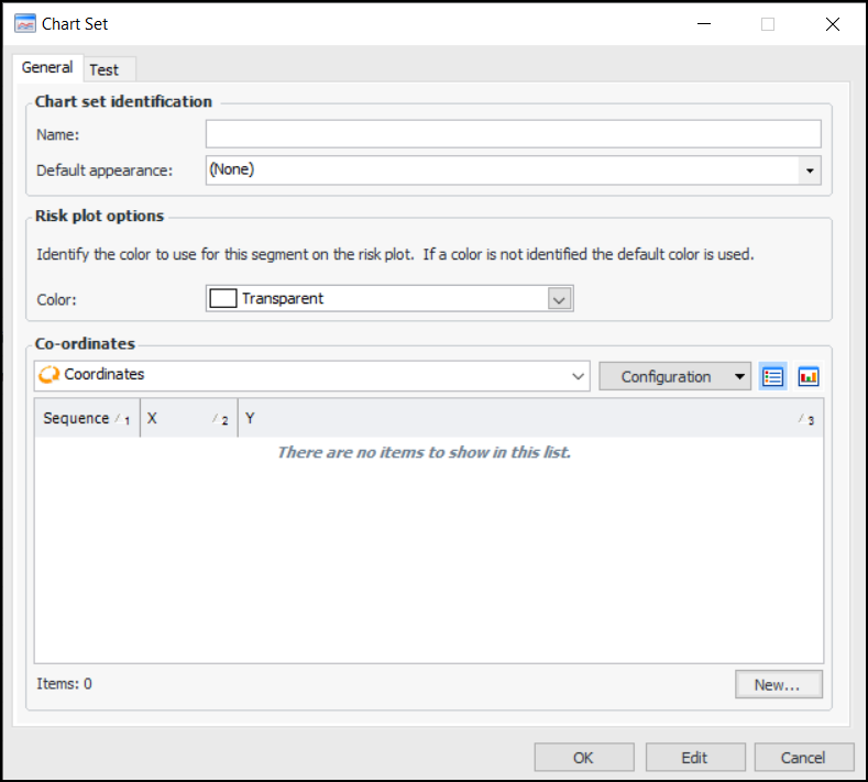
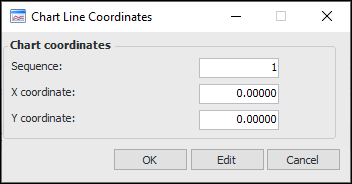
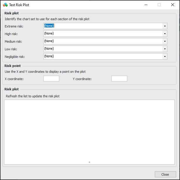
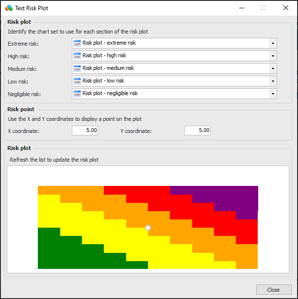
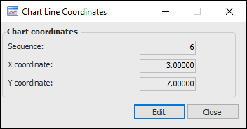
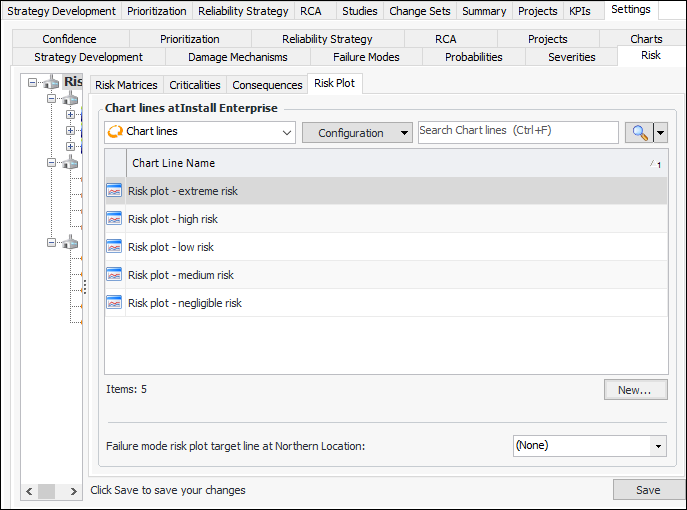
Setting up Risk Plot Lines and Areas

Risk plot charts provide a visual representation of an asset’s unmitigated (or initial) risk based on severity (consequence) and probability of failure. The risk value is determined by asset prioritization or strategy development analysis. If a feasibility evaluation is performed on a failure mode, the chart also shows the mitigated (or residual) risk.
The risk plot chart can appear in the following locations:
Asset Prioritization Analysis window, Worksheet and Summary views
Maintenance Action Plan window, Criticality and Feasibility views (MTA2, RCM2, RBI, SIF, HAZOP analyses)
Strategy Development Analysis window, Risk Assessment view, Risk Plot tab
Risk plot lines indicate risk tolerance levels to provide context for analysis results. You can create lines or sets of color areas and then assign them to analysis types or individual analyses. You can also set the default risk plot line for the site.
Here is an example of a chart that shows a single risk plot line:
Risk plot charts support as many as five color areas (named Extreme, High, Medium, Low, Negligible). You can change the default colors for the areas provided with APM: purple, red, orange, yellow, and green, respectively. Here is an example of a chart from a strategy development analysis:
This topic explains how to create risk plot lines and areas in the site’s strategy development settings on the Charts tab, where you can also test color areas in a chart.
You can also create risk plot lines in the site’s Strategy Development view, Settings tab, Risk tab, Risk Plot tab. In this location, you can set the default risk plot line for the site.
This topic explains how:

To Set up Risk Plot Lines and Areas

1.
On the site’s Strategy Development view, select the Settings tab, Charts tab, and the Chart target lines node in the tree.
The tab lists the colored chart areas supplied with APM. You can open a line to change its name, color, and coordinates.
2.
For each chart line or set that you need, click New. The Chart Set dialog appears.
3.
4.
To have the area filled with a color, click the arrow in the Color box and select a custom, web, or system color.
5.
For each coordinate on the line, click New. The Chart Line Coordinates dialog appears.
6.
7.
In the X coordinate box, enter the number on the X axis (consequences) where the coordinate is positioned.
8.
In the Y coordinate box, enter the number on Y axis (probability) where the coordinate is positioned.
9.
Click OK. The coordinate is added to the Chart Set dialog.
10.
When you have added all of the coordinates, click OK. The chart line is added to the table.

To Test Color Areas in a Chart

1.
On the Charts tab, click Test Risk Plot. The Test Risk Plot dialog appears:
2.
3.
Tip: Double-click anywhere in the chart to open the Chart Line Coordinates dialog, which shows the closest set of coordinates. For example:
4.

To Set the Default Risk Plot Line for the Site

1.
On the site’s Strategy Development view, select the Settings tab, the Risk tab, and the Risk settings node in the tree.
Tip: You can also select the site’s Administration menu, Strategy Development Settings, Risk Analysis and then Risk Analysis. The Risk Process and Matrix Settings dialog appears.
2.
Select the Risk Plot tab.
3.
Click Edit to modify the site settings. The Edit button is replaced by the Save button.
4.
Select a value in the Failure mode risk plot target line at this site list.
5.
Click Save.