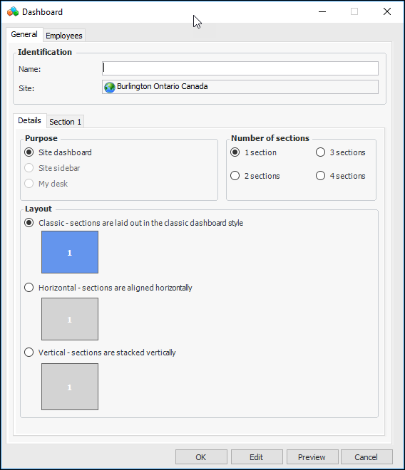
Defining Site Dashboards

Site dashboards are used to group and display performance indicators, comparative analyses, asset health indexes, and site information. For example, dashboards can show the current values for a group of key performance indicators or graphically trend indicator readings over a period of time. A site dashboard can have up to four sections, each displaying different information.
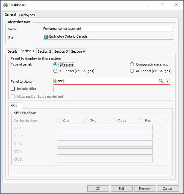
Site dashboards can be set up at the site level, in which case they are available to child sites. They can also be set up at the enterprise level using the Customization Center (select the User Interface tab and then the Dashboards tab). These dashboards are available to all sites in the enterprise.
A list of predefined panels is available to select from when you are setting up a dashboard to use on a site panel, KPI panel, or AHI panel. Examples of these panels are “Dashboard - Degradation rate summary - by indicator” and “KPI gauges panel - Aligned horizontally”. It is also possible to create custom panels to show in dashboards by using the Customization Center.
If the dashboard section displays KPI panels, a comparative analysis, or asset health index (AHI) panels, you must also select the indicators, analysis, or indexes to show in the panel. You can then click Preview to see the dashboard layout with current data.
Tip: To save time creating similar dashboards, you can copy an existing dashboard.
This topic explains how to set up dashboards at the site level. For information about using the Customization Center, see Customization Guide.

To Create a Site Dashboard

1.
From the Site window, select the Analytics view and then the Dashboards tab. By default, this tab lists all of the dashboards that exist for the current site and sites above it.
2.
Click New. The Dashboard window appears. The Site dashboard, 1 section, and Classic layout options are automatically selected.
3.
On the General tab, enter a name for the dashboard.
4.
5.
Classic – size and distribution of the sections vary. Use this style to indicate the prevalence or importance of sections.
Horizontal – Sections are of equal size and arranged horizontally.
Vertical – Sections are of equal size and arranged vertically.
6.
7.
Tip: To create a panel to be used in a dashboard, see Customization Guide.
This option is available when the dashboard has more than one section and the current section includes a title. When Allow section to be maximized is selected, the Expand icon appears on the section’s title bar. The user clicks the icon to expand the section to fill the tab, and the other dashboard sections disappear. The user can collapse the section to view all sections.
If the dashboard section displays KPI panels, click Browse to select each of the key performance indicators to display.
If the dashboard section displays AHI panels, click Browse to select each of the asset health indicators to display.
8.
If the section displays KPIs, a comparative analysis, or AHI panels, click Preview to see how the dashboard will look. You can then adjust the content and layout as needed.
Tip: Once the dashboard is assigned to employees, you can select the Employees tab to view a list of the employees who view the dashboard as their first dashboard, second dashboard, and so on. For information about assigning dashboards to users, see Adding an Employee.
9.
When you are finished defining your dashboard, click OK to save it. Your dashboard appears in the list of dashboards on the tab.