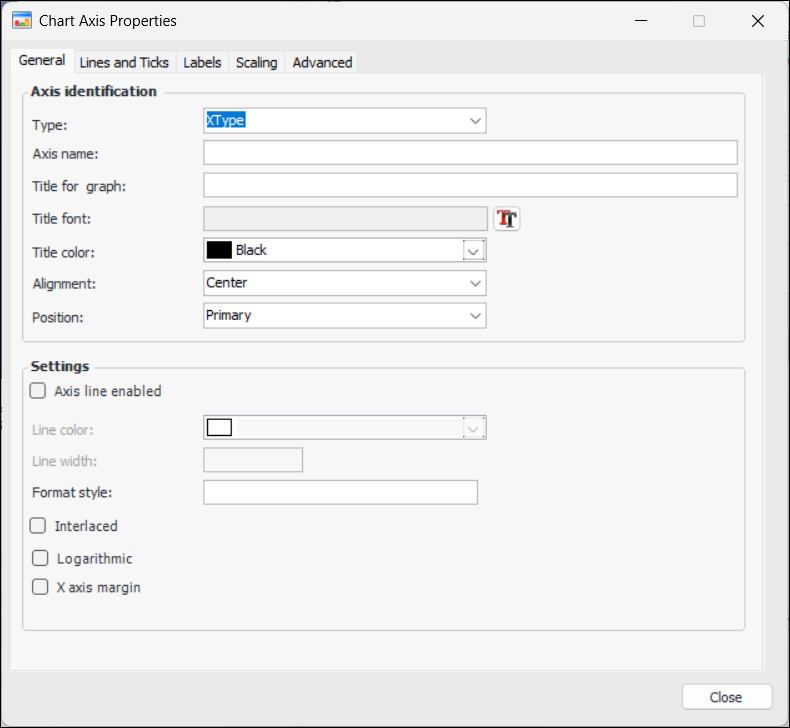
Defining an Axis for a Chart

You can define multiple axes for APM charts in which the font, line styles, colors, scaling, and positions are customized to suit your preference. The axis can then be applied to a data series.
An axis can also be selectively included based on the attribute of a class.
This topic describes how:

To Define Axis Identification and Settings

1.
2.
Select the Appearance tab, and then the Chart tab.
3.
Select the Axes tab and then click New. The Chart Axis Properties dialog appears, open to the General tab. For example:
Note: You can also create an axis from a chart’s data series, on the Graph Data Series dialog.
4.
Select an axis type. Your choices are XType or YType for X and Y axes, respectively.
5.
6.
7.
8.
9.
In the Settings area, you can enable the axis line. Select a color and specify the width.
10.
In the Format style box, enter a text pattern to format the axis line, if appropriate. Here is an example of x and y axes that use the Format Style text box. The x axis format style is:
{A:dd-MM HH:mm}
The y axis format style is:
{V} °F
The result is these axes:
Patterns can contain regular text and value placeholders in braces. To format numeric and date/time values, you can apply format specifiers. Use a colon to separate a placeholder and its format specifier.
Basic placeholders are:
{A} series point argument
{V} series point value
For more information about specifiers, see Format Specifiers.
11.
Select Interlaced if the axis colors are to be interlaced.
12.
Select Logarithmic if the axis is to use the logarithmic scale to display axis values.
13.
14.
15.
Repeat steps 3 to 14 for each axis you want to define.
TOP

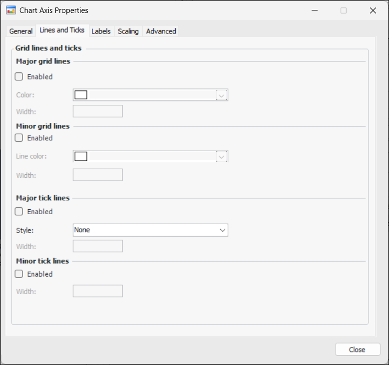
To Define Axis Lines and Ticks

1.
2.
Select the Lines and Ticks tab from the Chart Axis Properties dialog. For example:
3.
In the Major grid lines area, select Enabled to enable major grid lines for the axis and then select the color and width for the lines.
4.
In the Minor grid lines area, select Enabled to enable grid lines for the axis, and then select the color and width for the lines.
5.
In the Major tick line area, select Enabled to enable major tick lines for the axis, and then select the color and width for the lines.
6.
In the Minor tick lines area, select Enabled to enable minor tick lines for the axis, and then select the color and width for the lines.
7.
8.
Repeat steps 1 to 7 for each chart axis.
TOP

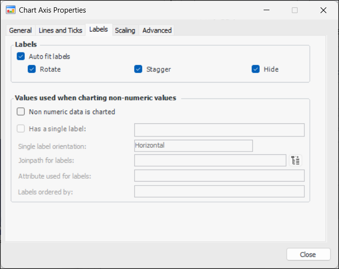
To Define Axis Labels

1.
2.
Select the Labels tab from the Chart Axis Properties dialog. For example:
3.
In the Labels area, select Auto fit labels, and then select the chart’s label properties that APM can adjust if necessary. Your options are:
4.
If non-numeric data are to be charted, select Non numeric data is charted and then you can select from the following information:
5.
Repeat steps 1 to for each axis label that you want to define.
TOP

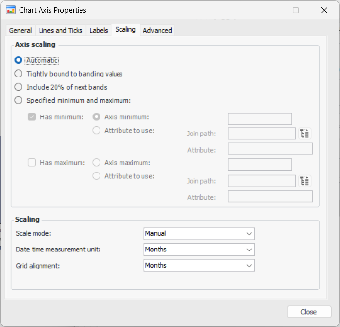
To Define Axis Scaling

1.
2.
Select the Scaling tab on the Chart Axis Properties dialog. For example:
3.
Automatic – APM determines the scaling based on the values in the axis.
Specified minimum and maximum – You must also include the minimum and/or maximum values or their attributes.
4.
Repeat steps 1 to 3 for each chart axis scaling that you want to define.
TOP

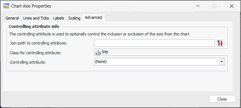
To Define Advanced Axis Settings

1.
2.
Select the Advanced tab from the Chart Axis Properties dialog. For example:
3.
4.
5.
Repeat steps 1 to 4 for each advanced axis setting that you want to apply.
TOP