Customizing Menus

You can customize the menus for any custom class. There are two types of menus that you can customize: the menu bar that appears at the top of all primary windows and the pop-up (right-click) menu.
If you are creating menus for a custom class that was created from scratch, or if you are editing menus for a custom class that is based on an APM class, you can edit the menus from the base class. In order to do this, you will copy (reinherit) the menus from the base class and then add or remove menu items.
Some menu items need to be included for basic navigation. We recommend that you re-inherit all of the menus, adding or removing only the items that you need to change. Following the default organization and naming conventions will make it easier for users who are familiar with Windows-based applications to find the options that they need.
There are four possible menu functions:
The menu items that invoke methods or display dialogs are children of menu buttons in the menu hierarchy. You can use separators to group the menu items in a meaningful way. Menu buttons and separators are essentially graphical elements. Menu items make the menu function by either invoking a method or displaying a dialog. You must create at least one menu button with one menu item for your custom menu to appear.
The main steps in customizing menus are:

To Customize Menus for a Custom Class

1.
2.
Select the Customization Center view.
3.
Click Lock for Customization.

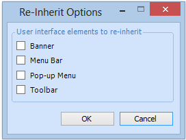
Re-inherit Menus for the Custom Class
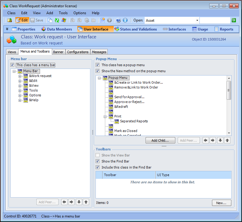
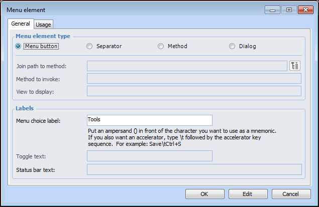
4.
5.
6.
From the Tools menu, select Re-inherit User Interface. The Reinherit Options dialog appears.
7.
Select Menu Bar and Popup Menu and then click OK.
8.

Edit the Main Menus

9.
Select the User Interface view, Menus and Toolbars tab. For example:
An item called Menu bar is at the top of the menu hierarchy. The menu buttons are children of this item, and the menu items are children of the menu buttons.
10.
Tip: You can also add peer elements using the Add Peer button, or rearrange the menu elements in the hierarchy using the arrow buttons.
The Menu Element dialog appears. This example is for editing a menu element:
When you are adding a menu element, Method is selected by default.
11.
Menu button: adds a label to the menu. Select this option to add a label under which you want to add child menu items.
Separator: adds a separator line to the menu
Method: adds a menu item that invokes a method. When you select this option, you can select from any method available in the system.
Note: When you are adding a new menu element, you can select a join path to a related class. The Method to invoke list displays the methods for that class.
Dialog: adds a menu item that displays a dialog. When you select this option, you can select any dialog that belongs to the class that owns the configuration. For example, if the configuration is on a site view, you can select any dialog owned by the Site class.
You can also define a shortcut to the menu item (for example, Ctrl + S to save an object). To do this, type “\t” after the menu element label followed immediately by the shortcut key sequence. This left-aligns all the shortcuts on a menu at the first tab position after the longest menu item. Do not use spaces for alignment because they may not display properly.
Match key names with those commonly inscribed on the keycap. For example, for Ctrl and Shift key combinations type “Ctrl+” and “Shift+”. For example, the menu label for a Properties view might look like this:
Properties Ctrl+P.
12.
Click OK to save the menu element.
13.
14.

Edit the Pop-up Menu

15.
Click in the Pop-up Menu section.
16.
17.

Test the Menus

You can now check the menus to see if they work correctly.
18.
19.
20.