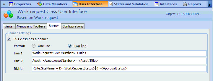
Customizing Banners

The bar below the toolbar and above the view is called the banner. Banners include an icon and can consist of fixed text or attribute values. You can include up to two lines of text as well as three lines at the right side of the banner. Banners are defined for each class; every primary view within that class will use the same banner. However, the actual banner text can change depending on the specific instance of the class that you open.
Attributes do not appear in the banner until there is text in them. For example, the Work Type attribute will not appear in the Work Order Task’s banner until you select the work type for the open work order.

Work Order Task Banner

The following image shows the banner for the Work Order Task class. Because there is one window for both work orders and work order tasks, this is the banner that you see when you open either object. The banner also includes attributes from both of the classes.
This banner includes one line of text that includes three attributes, a second line of text with one attribute, as well as text at the right hand side. The attributes in the first line of text are Work Order Number from the Work Order class (a join path is needed to include attributes from other classes) and Task Number and WOAndTaskTitle from the Work Order Task class. The code to display this information looks like this:
Work Order Task: <WorkOrder.WorkOrderNumber>-<TaskNumber>: <WOAndTaskTitle>
The join path for the first attribute (in the angle brackets) states the name of the class that includes the attribute (WorkOrder) and then the name of the attribute (WorkOrderNumber). Since the other two attributes exist in the Work Order Task class (which owns the banner), no path is necessary. In this case, just the attribute names are listed in the brackets.
The second line of text shows the work type that was selected for the work order. The code to display this information is:
<WorkType.WorkType>
Because Work Type is also a separate class, this attribute also requires a join path. The first part (WorkType) lists the name of the class; the second part (WorkType) is the member name of the work type title attribute in the Work Type class.
The text at the right side of the banner provides the name of the site that owns the work order, the status of the work order, and the status of the individual work order task. To place these attributes on separate lines, the code <l> (lowercase L) is used between attributes:
<WorkOrder.Site.SiteName><l>Work order status: <WorkOrder.WOStatus><l>Task status: <WOStatus>
The first attribute uses a join path to the Site class; the second attribute has a join path to the Work Order class; and the third attribute exists within the Work Order Task class (and therefore doesn’t use a join path).
You can add whatever attributes you want by following the pattern shown in these examples.
You can customize the banner for any class. Banners are not additive: elements of the banner in the base class will not appear with the elements you customize. For example, if you customize the first line of the banner on the Work Order class, the status indicators on the right side of the banner will not appear.
Since you may want to recreate some elements of the original banner, there are two basic steps to customize banners: re-inherit the banner from the base class and then modify it to create your new version.
The main steps in customizing banners are:

To Create a Custom Banner

1.
2.
Select the Customization Center view.
3.
Click Lock for Customization.

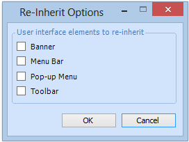
Reinherit the Banner

4.
5.
6.
From the Class menu, select Re-inherit User Interface. The Reinherit Options dialog appears.
7.
Select the Banner option and then click OK.
8.
Select the User Interface view, Banner tab.

Create a Custom Banner

9.
Make sure that This class has a banner is selected.
10.
11.
In the Line 1 and Line 2 boxes, edit the text so that it contains the text and attributes that you want in each line.
12.
In the Right box, enter the text and attributes that you want to display on the right side of the banner, separating the lines with a <l>.
13.

Test the Banner

You can now check the banner to see if it displays correctly.
14.